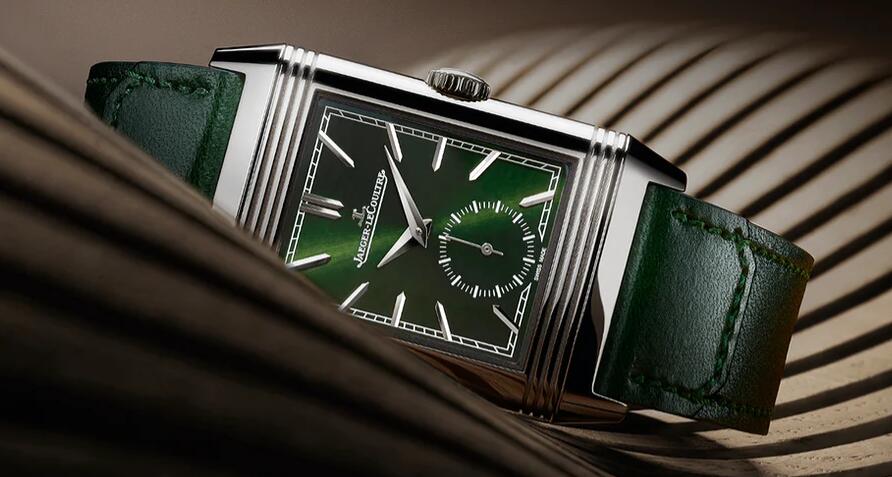
For me, one of the most attractive modern Jaeger-LeCoultre Reverso watches has always been the Reverso Tribute models, which have beautiful faceted dauphine hands, colored dials, applied bar indexes, and a small seconds display at 6:00. The first Tribute watches came out in 2011, and that same year, JLC also released what I think is still the nicest time-only Reverso of the 21st century, which is the Tribute to 1931 New York edition. JLC has just released, for Watches & Wonders 2021, the latest Tribute Reverso, this time with a deep green dial.
Technically, it’s identical to its predecessors – the reversible case is 45.6 x 27.4 mm, and 8.5mm thick, and the movement is the oval JLC caliber 822/2, with a 45-hour power reserve.
The Tribute watches have the name because they are a shout-out to the Jaeger-LeCoultre Reverso watches from the 1930s, which came out in a number of colors, including white, red, chocolate, and navy blue. This is probably a purely personal view, but I have always thought that colored dials seem to pop more on square and rectangular watches – I think for instance of the Tetras, from NOMOS, although there are innumerable other examples (and hey, how about the new Tank Must watches?)
A rectilinear case, whether square or rectangular, seems to act more overtly as a frame for a composition than a round case, and they have always felt to me a more active part of a watch design as a whole, as opposed to round cases, which seem to want to fade a bit into the background and let the dial and dial furniture shine (this is, of course, a gross oversimplification on which I expect to be vigorously challenged, but I think there’s a grain of truth there). For all that green dials are unquestionably in vogue this year (at least so far), some watches are more successful than others at pulling off the effort at some chromatic sprezzatura, and given that we, and JLC, have had 80 years to get used to the idea, a green-dial Tribute Reverso feels like a natural, and a home run at that.
